Color themes define the colors of the text editing area and the syntax highlighting. A color theme encompasses the following:
The text style, used for syntax highlighting through the default styles attributes. For example, the text color and the selected text color.
The background of the text editing area, including the text selection and the current line.
The icon border of the text area: their background, the separator line, the line numbers, the line word wrap markers, the modified line marks and the code folding.
Text decorators such as the search markers, the indentation and tab/space line marks, the bracket matching and the spell checking.
Bookmarks and snippets.
To avoid confusion, the following is out of scope:
The font type and the font size.
The colors of the text editing application, such as the scroll bar map, the menus, the tab bar, the window color, etc. In KDE applications, like Kate or KDevelop, these colors are defined by the
KDE Plasma™ global color scheme, which are set in the “Colors” module in System Settings or from the application itself in the menu → .
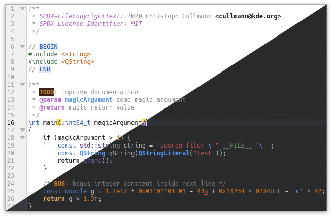
“Breeze Light” and “Breeze Dark” color themes with the “C++” syntax highlighting.
The KSyntaxHighlighting
framework, which is the syntax highlighting engine,
is the library that provides and manages the color themes.
This is part of KDE Frameworks™ and is used in KDE text editors such as
Kate,
KWrite,
Kile and
KDevelop.
This dependency looks like the following:
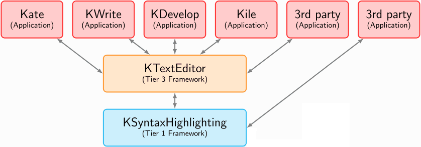
Dependence of KDE Frameworks™ libraries on text editors.
KSyntaxHighlighting includes a variety of built-in themes which are displayed on the “Color Themes” page of the Kate editor website.
The KTextEditor framework, which is the text editing engine, provides a user interface for creating and editing color themes, including a tool for importing and exporting themes. This is the simplest way to create and edit them, you can access it from the “Configure” dialog of the text editor. More details in the section called “The Color Themes GUI”.
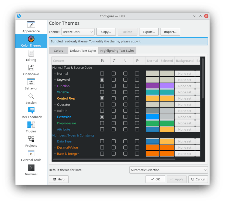
The GUI to manage color themes in Kate's settings.
It is important to mention that, in the KDE text editors like Kate or KDevelop,
the KSyntaxHighlighting color themes are used
since
KDE Frameworks™ 5.75, released on October 10, 2020. Previously, Kate's color
schemes (KConfig based schema config) were used and are now deprecated. However, it is
possible to convert the old Kate schemes to the KSyntaxHighlighting color themes.
The KSyntaxHighlighting
repository includes the utils/kateschema_to_theme_converter.py
script and the utils/schema-converter/ utility for that purpose.
Color themes are stored in JSON format files, with the
.theme extension.
In the
KSyntaxHighlighting source code, the JSON files of built-in themes
are located in the data/themes/ directory.
Note that in text editors, the built-in themes are compiled into the
KSyntaxHighlighting library, therefore, the way to access them is through the
source code or by exporting them
from the GUI to manage themes of KTextEditor.
It is also possible to easily add additional or custom themes, which are
loaded from the file system. User-customized theme files are located in the
org.kde.syntax-highlighting/themes/
directory in your user folder, which you can find with the command
qtpaths
and are commonly --paths GenericDataLocation$HOME/.local/share//usr/share/.
In Flatpak and Snap packages, the above directory will not work
as the data location is different for each application.
In a Flatpak application, the location of custom theme files is usually
$HOME/.var/app/flatpak-package-name/data/org.kde.syntax-highlighting/themes/$HOME/snap/snap-package-name/current/.local/share/org.kde.syntax-highlighting/themes/
On Windows® these files are located
%USERPROFILE%\AppData\Local\org.kde.syntax-highlighting\themes.
%USERPROFILE% usually expands to
C:\Users\.user-name
In summary, for most configurations the custom themes directory is as follows:
| For local user | |
| For all users | /usr/share/org.kde.syntax-highlighting/themes/ |
| For Flatpak packages | |
| For Snap packages | |
| On Windows® | %USERPROFILE%\AppData\Local\org.kde.syntax-highlighting\themes |
If multiple theme files exist with the same name, the file with the highest revision will be loaded.
The structure of a JSON file is explained on their website. Basically, a JSON format file consists of:
Collections of key/value pairs, separated by commas and grouped in
{ }which we will call “objects”.Ordered lists of values, separated by commas and grouped in
[ ]which we will call “array”.
The nomenclature “key”, “value”, “object” and “array” will be used in this article. If this is your first time working with JSON files, understanding them is as simple as looking at the examples below.
The root object of the color theme JSON file contains the following schema keys:
metadata: It is mandatory. The value is an object with the theme's metadata, such as name, revision and license.This is detailed in the section called “Metadata”.
editor-colors: It is mandatory. The value is an object with the colors of the text editing area, such as the background, the icon border and the text decoration.This is detailed in the section called “Editor Colors”.
text-styles: It is mandatory. The value is an object with the default text style attributes of the syntax highlighting. Each attribute defines its text color, its selected text color, or whether it bold or italic, for example. The text styles can be referenced from the attributes of the syntax definition XML files.This is detailed in the section called “Default Text Styles”.
custom-styles: It is optional. Defines text styles for the attributes of specific syntax highlighting definitions. For example, in a highlighting definition such asPythonorMarkdownyou can specify a different text style that overrides the default defined intext-styles.This is detailed in the section called “Custom Highlighting Text Styles”.
The JSON language does not support comments. However, you can use the
optional key _comments in the root object to write comments,
for example, if you are adapting an existing theme you can put the URL of the
original repository. The most practical way is to use an array of strings.
Below is an example file for the “Breeze Light” theme.
You can notice that, to avoid the example being too large, the
editor-colors and text-styles
objects do not contain all the required keys. You can see the full archive of
the “Breeze Light” theme in the KSyntaxHighlighting repository.
{
    "_comments": [
        "This is a comment.",
        "If this theme is an adaptation of another, put the link to the original repository."
    ],
    "metadata": {
        "name" : "Breeze Light",
        "revision" : 5,
        "copyright": [
            "SPDX-FileCopyrightText: 2016 Volker Krause <vkrause@kde.org>",
            "SPDX-FileCopyrightText: 2016 Dominik Haumann <dhaumann@kde.org>"
        ],
        "license": "SPDX-License-Identifier: MIT"
    },
    "editor-colors": {
        "BackgroundColor" : "#ffffff",
        "CodeFolding" : "#94caef",
        "BracketMatching" : "#ffff00",
        "CurrentLine" : "#f8f7f6",
        "IconBorder" : "#f0f0f0",
        "IndentationLine" : "#d2d2d2",
        "LineNumbers" : "#a0a0a0",
        "CurrentLineNumber" : "#1e1e1e",
        The other editor color keys...

    },
    "text-styles": {
        "Normal" : {
            "text-color" : "#1f1c1b",
            "selected-text-color" : "#ffffff",
            "bold" : false,
            "italic" : false,
            "underline" : false,
            "strike-through" : false
        },
        "Keyword" : {
            "text-color" : "#1f1c1b",
            "selected-text-color" : "#ffffff",
            "bold" : true
        },
        "Function" : {
            "text-color" : "#644a9b",
            "selected-text-color" : "#452886"
        },
        "Variable" : {
            "text-color" : "#0057ae",
            "selected-text-color" : "#00316e"
        },
        The other text style keys...

    },
    "custom-styles": {
        "ISO C++": {
            "Data Type": {
                "bold": true,
                "selected-text-color": "#009183",
                "text-color": "#00b5cf"
            },
            "Keyword": {
                "text-color": "#6431b3"
            }
        },
        "YAML": {
            "Attribute": {
                "selected-text-color": "#00b5cf",
                "text-color": "#00b5cf"
            }
        }
    }
}
The JSON object of the metadata key contains
relevant information on the theme. This object has the following keys:
name: It is a string sets the name of the language. It appears in the menus and dialogs afterwards. It is mandatory.revision: It is an integer number that specifies the current revision of the theme file. Whenever you update a color theme file, make sure to increase this number. It is mandatory.license: It is a string that defines the license of the theme, using the identifierSPDX-License-Identifierfrom the standard SPDX license communication format. It is optional.You can see the full list of SPDX license identifiers here.
copyright: It is an array of strings that specifies the authors of the theme, using the identifierSPDX-FileCopyrightTextfrom the standard SPDX license communication format. It is optional.
"metadata": {
    "name" : "Breeze Light",
    "revision" : 5,
    "copyright": [
        "SPDX-FileCopyrightText: 2016 Volker Krause <vkrause@kde.org>",
        "SPDX-FileCopyrightText: 2016 Dominik Haumann <dhaumann@kde.org>"
    ],
    "license": "SPDX-License-Identifier: MIT"
}
This section details all the available color attributes and available color settings.
Corresponds to the colors of the text editing area.
In the JSON theme file, the respective key
editor-colors has as value an object where each
key references an attribute color of the text editor. Here, all available keys
are mandatory, their values are strings with hexadecimal
color codes, like “#00B5CF”.
In the GUI to manage themes of KTextEditor,
these attributes can be modified in the Colors tab.
The available keys are the following; the keys used in the JSON file are listed in bold, the names used in the GUI are shown in parentheses.
- Editor Background Colors
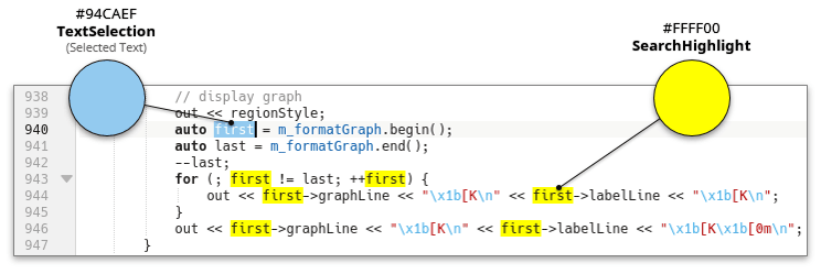
BackgroundColor(Text Area)This is the default background for the editor area, it will be the dominant color on the editor area.

TextSelection(Selected Text)This is the background for selected text.

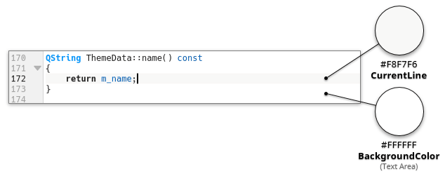
CurrentLine(Current Line)Set the color for the current line. Setting this a bit different from the Normal text background helps to keep focus on the current line.
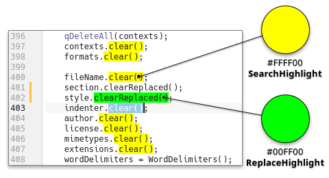
SearchHighlight(Search Highlight)Set the color for the text that matches your last search.
ReplaceHighlight(Replace Highlight)Set the color for the text that matches your last replace operation.
- Icon Border
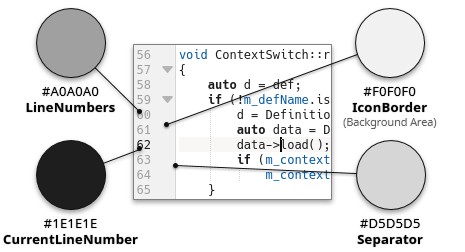
IconBorder(Background Area)This color is used for the marks, line numbers and folding marker borders in the left side of the editor view when they are displayed.
LineNumbers(Line Numbers)This color is used to draw the line numbers on the left side of the view when displayed.
CurrentLineNumber(Current Line Number)This color is used to draw the line number of the current line, on the left side of the view when displayed. Setting this a bit different from “LineNumbers” helps to keep focus on the current line.
Separator(Separator)This color is used to draw the vertical line that separates the icon border from the background of the text area.
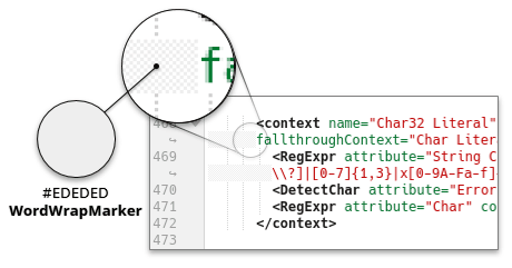
WordWrapMarker(Word Wrap Marker)This color is used to draw a pattern to the left of dynamically wrapped lines when those are aligned vertically, as well as for the static word wrap marker.
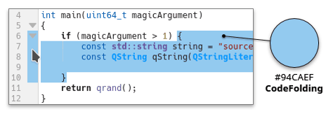
CodeFolding(Code Folding)This color is used to highlight the section of code that would be folded when you click on the code folding arrow to the left of a document. For more information, see the code folding documentation.
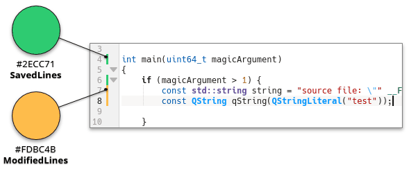
ModifiedLines(Modified Lines)This color is used to highlight to the left of a document lines that have been modified but not yet saved. For more information, see the section called “Line Modification Indicators”.
SavedLines(Saved Lines)This color is used to highlight to the left of a document lines that have been modified this session and saved. For more information, see the section called “Line Modification Indicators”.
- Text Decorations
SpellChecking(Spelling Mistake Line)This color is used to indicate spelling mistakes.

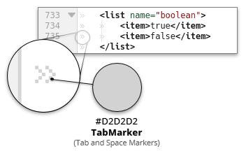
TabMarker(Tab and Space Markers)This color is used to draw white space indicators, when they are enabled.
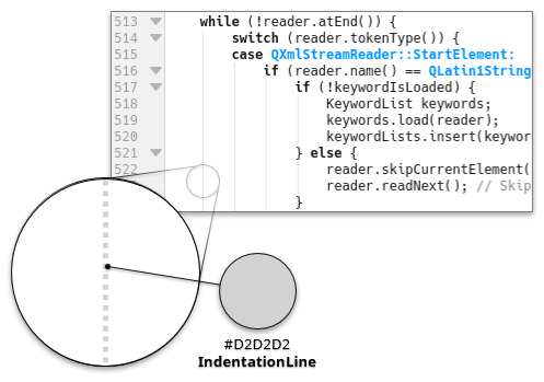
IndentationLine(Indentation Line)This color is used to draw a line to the left of indented blocks, if that feature is enabled.
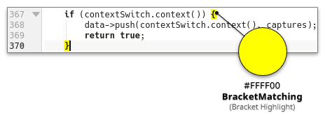
BracketMatching(Bracket Highlight)This color is used to draw the background of matching brackets.
- Marker Colors
MarkBookmark(Bookmark)This color is used to indicate bookmarks. Note that this color has an opacity of 22% (and 33% for the current line) with respect to the background. For more information, see the section called “Using Bookmarks”.

MarkBreakpointActive(Active Breakpoint)This color is used by the GDB plugin to indicate an active breakpoint. Notice that this color has an opacity to the background. For more information, see the GDB Plugin documentation.
MarkBreakpointReached(Reached Breakpoint)This color is used by the GDB plugin to indicate a breakpoint you have reached while debugging. Notice that this color has an opacity to the background. For more information, see the GDB Plugin documentation.
MarkBreakpointDisabled(Disabled Breakpoint)This color is used by the GDB plugin to indicate an inactive breakpoint. Notice that this color has an opacity to the background. For more information, see the GDB Plugin documentation.
MarkExecution(Execution)This color is used by the GDB plugin the line presently being executed. Notice that this color has an opacity to the background. For more information, see the GDB Plugin documentation.
MarkWarning(Warning)This color is used by the build plugin to indicate a line that has caused a compiler warning. Notice that this color has an opacity to the background. For more information, see the Build Plugin documentation.
MarkError(Error)This color is used by the build plugin to indicate a line that has caused a compiler error. Notice that this color has an opacity to the background. For more information, see the Build Plugin documentation.
- Text Templates & Snippets
TemplateBackground(Background)This color is used by the Kate Snippets plugin to mark the background of a snippet. For more information, see the Kate Snippets documentation.
TemplatePlaceholder(Editable Placeholder)This color is used by the Kate Snippets plugin to mark a placeholder that you can click in to edit manually. For more information, see the Kate Snippets documentation.
TemplateFocusedPlaceholder(Focused Editable Placeholder)This color is used by the Kate Snippets plugin to mark the placeholder that you are presently editing. For more information, see the Kate Snippets documentation.
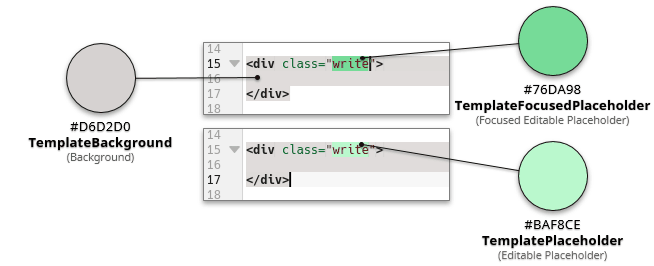
TemplateReadOnlyPlaceholder(Not Editable Placeholder)This color is used by the Kate Snippets plugin to mark a placeholder that cannot be edited manually, such as one that is automatically populated. For more information, see the Kate Snippets documentation.

The default text styles are inherited by the highlight text styles, allowing the editor to present text in a very consistent way, for example comment text is using the same style in almost all of the text formats that KSyntaxHighlighting can highlight.
Note
These text styles can be referenced from the default styles used
in syntax highlighting definition XML files, for example,
the “Normal” attribute is equivalent to “dsNormal” in the XML files,
and “DataType” is equivalent to “dsDataType”.
See the section called “Available Default Styles” in the syntax highlighting documentation.
Tip
Make sure to choose readable colors with good contrast especially in combination with
the Editor Colors.
See the section called “Contrast of Text Colors”.
In the JSON file, the respective key
text-styles has as value an object where
each key corresponds to the name of a default text style, which are
equivalent to those used in the syntax highlighting definitions. Here, all available
text style keys are mandatory, these are listed below.
"text-styles": {
    "Normal" : {
        "text-color" : "#1f1c1b",
        "selected-text-color" : "#ffffff",
        "bold" : false,
        "italic" : false,
        "underline" : false,
        "strike-through" : false
    },
    "Keyword" : {
        "text-color" : "#1f1c1b",
        "selected-text-color" : "#ffffff",
        "bold" : true
    },
    "Function" : {
        "text-color" : "#644a9b",
        "selected-text-color" : "#452886"
    },
    The other text style keys...
}
- Each key of default text style has a JSON object as its value, where values such as color, bold, italic, etc. are specified. These keys are as follows:
text-color: It is a string with the text color in hexadecimal color code. This key/value is required.selected-text-color: The text color when it is selected is generally the same value as “text-color”. When the text is selected, the background is defined by the value of TextSelection in the Editor Colors, so you must ensure that the text has good contrast and is readable with this background. The value is a string with a hexadecimal color code. This key/value is required.bold: It is a boolean that determines if the text is in bold. This key is optional, the default value isfalse.italic: It is a boolean that determines if the text is curved. This key is optional, the default value isfalse.underline: It is a boolean that determines if the text is underlined. This key is optional, the default value isfalse.strike-through: It is a boolean that determines if the text is strike through. This key is optional, the default value isfalse.background-color: Determines the background of the text, used for example in alerts in comments. The value is a string with a hexadecimal color code. This key is optional, by default there is no background.selected-background-color: Determines the background of the text when it is selected. The value is a string with a hexadecimal color code. This key is optional, by default there is no background.
In the GUI to manage color themes of KTextEditor,
these attributes can be modified in the Default Text Styles
tab. The name in the list of styles is using the style configured for the item, providing you
with an immediate preview when configuring a style. Each style lets you select common attributes
as well as foreground and background colors. To unset a background color, right-click to
use the context menu.
The available text style keys are the following; the keys used in the JSON file are listed in bold, the names used in the GUI are shown in parentheses if they are different.
- Normal Text & Source Code
Normal: Default text style for normal text and source code without special highlighting.Keyword: Text style for built-in language keywords.Function: Text style for function definitions and function calls.Variable: Text style for variables, if applicable. For instance, variables in PHP/Perl typically start with a$, so all identifiers following the pattern$fooare highlighted as variable.ControlFlow(Control Flow): Text style for control flow keywords, such as if, then, else, return, switch, break, yield, continue, etc.Operator: Text style for operators, such as+,-,*,/,%, etc.BuiltIn(Built-in): Text style for built-in language classes, functions and objects.Extension: Text style for well-known extensions, such as Qt™ classes, functions/macros in C++ and Python or boost.Preprocessor: Text style for preprocessor statements or macro definitions.Attribute: Text style for annotations or attributes of functions or objects, e.g.@overridein Java, or__declspec(...)and__attribute__((...))in C++.- Numbers, Types & Constants
DataType(Data Type): Text style for built-in data types such as int, char, float, void, u64, etc.DecVal(Decimal/Value): Text style for decimal values.BaseN(Base-N Integer): Text style for numbers with base other than 10.Float(Floating Point): Text style for floating point numbers.Constant: Text style for language constants and user defined constants, e.g. True, False, None in Python or nullptr in C/C++; or math constants like PI.- Strings & Characters
Char(Character): Text style for single characters such as'x'.SpecialChar(Special Character): Text style for escaped characters in strings, e.g. “hello\n”, and other characters with special meaning in strings, such as substitutions or regex operators.String: Text style for strings like “hello world”.VerbatimString(Verbatim String): Text style for verbatim or raw strings like'raw \backlash'in Perl, CoffeeScript, and shells, as well asr'\raw'in Python, or such as HERE docs.SpecialString(Special String): Text style for special strings, such as regular expressions in ECMAScript, the LATEX math mode, SQL, etc.Import(Imports, Modules, Includes): Text style for includes, imports, modules or LATEX packages.- Comments & Documentation
Comment: Text style for normal comments.Documentation: Text style for comments that reflect API documentation, such as/** doxygen comments */or"""docstrings""".Annotation: Text style for annotations in comments or documentation commands, such as@paramin Doxygen or JavaDoc.CommentVar(Comment Variable): Text style that refers to variables names used in above commands in a comment, such asfoobarin “@param foobar”, in Doxygen or JavaDoc.RegionMarker(Region Marker): Text style for region markers, typically defined by//BEGINand//ENDin comments.Information: Text style for information, notes and tips, such as the keyword@notein Doxygen.Warning: Text style for warnings, such as the keyword@warningin Doxygen.Alert: Text style for special words in comments, such asTODO,FIXME,XXXXandWARNING.- Miscellaneous
Error: Text style indicating error highlighting and wrong syntax.Others: Text style for attributes that do not match any of the other default styles.
Here you can establish text styles for a specific syntax highlighting definition,
overriding the default text style described in
the previous section.
In the JSON theme file, this corresponds
to the custom-styles key, whose value is an object
where each subschema key corresponds to the name of a syntax highlighting definition.
Its value is an object where each key refers to the style attributes
name defined in the itemData
elements of the syntax highlighting XML file, and the respective value is a sub-object with the keys
text-color, selected-text-color, bold,
italic, underline, strike-through,
background-color and selected-background-color, defined in
the previous section. Each of these values are optional,
since if they are not present, the style set in text-styles is considered.
For example, in this piece of code, the “ISO C++” syntax highlighting definition
has a special text style for the “Type Modifiers” and “Standard Classes”
attributes. In the corresponding XML file “isocpp.xml”, the defined attribute
“Standard Classes” uses the default style BuiltIn (or dsBuiltIn).
In this attribute, only the value of text-color is overwritten by the new
color “#6431b3”.
"custom-styles": {
    "ISO C++": {
        "Standard Classes": {
            "text-color": "#6431b3"
        },
        "Type Modifiers": {
            "bold": true,
            "selected-text-color": "#009183",
            "text-color": "#00b5cf"
        }
    }
}
Note
You should consider that these text styles are associated with the attribute names defined in the syntax highlighting XML files. If an XML file is updated and some attributes are renamed or removed, the custom style defined in the theme will no longer apply.
Syntax highlighting definitions often include other definitions. For example, the “QML” highlighter includes the “JavaScript” highlighter, since they share functionality in highlighting.
In the GUI to manage themes of KTextEditor,
these attributes can be modified in the
Highlighting Text Styles tab.
By default, the editor preselects the highlighting of the current document. You will notice that
many highlights contain other highlights represented by groups in the style list. For example
most highlights import the “Alert” highlight, and many source code formats import
the “Doxygen” highlight.
The simplest way to create and edit color themes is through the GUI within the “Configure” dialog provided by KTextEditor. To access it, select → from the menubar in your text editor. This brings up the Configure dialog box, there select Color Themes in the side panel.
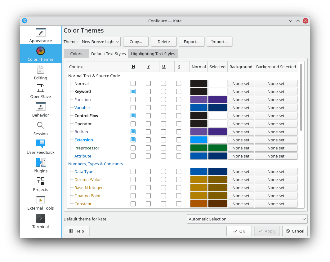
Kate's settings dialog box with the color theme management.
In this dialog you can configure all the colors
in any theme you have, as well as create/copy new themes, delete them, export them to a
.theme file with JSON format
or import them from external .theme files. Each theme has settings
for text colors and styles.
The built-in themes cannot be modified by default. To do this, you need to copy them and give them a new name.
To use a theme permanently in your text editor, you must select it in the combobox
labeled Default theme for Application at
the bottom of the dialog and press or .
By default, the Automatic Selection option is
active, which chooses a more appropriate color theme according to the
KDE Plasma™ color scheme used in the text editing application;
it usually chooses between “Breeze Light” and “Breeze Dark”
if the scheme is light or dark, respectively.
Tip
You can adjust the KDE global color scheme in the “Colors” module in System Settings. You can also change it in some applications individually such as Kate or KDevelop, from the menu → .
To create a new theme, it is first necessary to copy an existing one. Select an existing theme which you want to use as a base, such as “Breeze Light” or “Breeze Dark”, and click . Then write a name for the new theme.
If you want to modify a built-in or read-only theme, you must first copy it under a different name.
You can export a selected theme (including built-in ones) to a
JSON file with .theme
extension, with the button. This will open a dialog
to save the file. To add a color theme from an external
JSON file, just press the
button and select the
.theme file from the dialog.
Tip
As mentioned above, user-customized theme files are stored in the
org.kde.syntax-highlighting/themes/directory. When you copy or create a theme, it will automatically appear there. Also, importing or adding a theme is equivalent to copying an external.themefile into this directory. KSyntaxHighlighting automatically picks up color theme files from this directory.If you want to publish a theme created by you, it is essential to check the metadata object of the JSON file, adding the respective license and checking the revision number.
Here the colors of the text editing area are adjusted. These are detailed in the section called “Editor Colors”.
The default text styles are inherited by the highlight text styles, allowing the editor to present text in a very consistent way, for example comment text is using the same style in almost all of the text formats that KSyntaxHighlighting can highlight.
The name in the list of styles is using the style configured for the item, providing you with an immediate preview when configuring a style.
Each style lets you select common attributes as well as foreground and background colors. To unset a background color, right-click to use the context menu.
The attributes of this area are detailed in the section called “Default Text Styles”.
Here you can edit the text styles used by a specific highlight definition. The editor preselects the highlight used by your current document. To work on a different highlight, select one in the Highlight combobox above the style list.
The name in the list of styles is using the style configured for the item, providing you with an immediate preview when configuring a style.
Each style lets you select common attributes as well as foreground and background colors. To unset a background color, right-click to use the context menu. In addition you can see if a style is equal to the default style used for the item, and set it to that if not.
You will notice that many highlights contain other highlights represented by groups in the style list. For example most highlights import the Alert highlight, and many source code formats imports the Doxygen highlight. Editing colors in those groups only affects the styles when used in the edited highlight format.
An important aspect when working with color themes is to choose a text contrast that makes it easier to read, especially in combination with the background.
The Kontrast application is a color contrast checker. It tells
you that the text color and background color combinations are readable and accessible, so
this is an excellent tool to help you create color themes.
You can download Kontrast from
the KDE Applications website
or from the Flatpak
package on Flathub (only in GNU/Linux).
The GNOME Contrast application is similar. You can download
the Flatpak
package on Flathub (only in GNU/Linux).
KSyntaxHighlighting includes more than 300 syntax highlighting definitions, therefore it is ideal that you make sure your new theme looks good in all syntax highlighting definitions. The built-in color themes have the following similarities that it is recommended (but not required) to follow to achieve a correct display of all syntax highlighting definitions:
Use bold for the “Keyword” and “ControlFlow” text styles.
Do not use background color in any text style, except “Alert” and “RegionMarker”.
Most of the syntax highlighters are intended to look good on the default themes “Breeze Light” and “Breeze Dark”, therefore, another way to maintain consistency is to use similar colors in the text styles, like green for “Preprocessor” and “Others”, blue for “DataType” and “Attribute”, or purple for “Function”.
Note that these recommendations are not mandatory when creating and publishing a theme.