 Finding Your Way Around
Table of Contents
The KDE Plasma Workspaces™ feature many different graphical user interface elements, commonly known as “widgets”. This guide will introduce you to their names and functions.
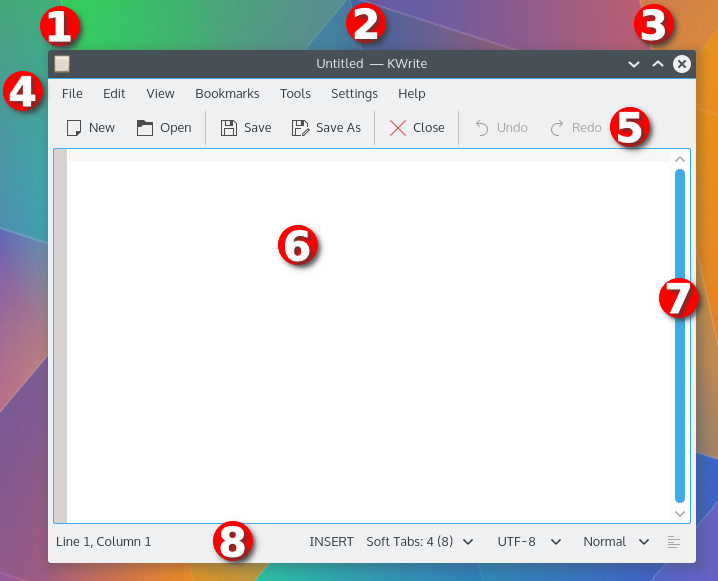
This is the window of the KWrite, a text editor. Click on part of the window to learn more about it.
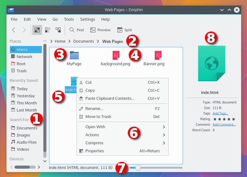
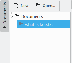
This is the another window, that of the Dolphin file manager. Click on part of the window to learn more about it.
A panel that contains a list of Places on the computer system
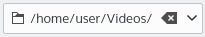
A Breadcrumb of the path of the displayed folder
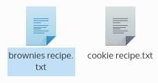
A folder Icon
A file Icon
A highlighted Icon
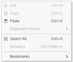
A Context Menu listing actions that can be performed on a file
More Panels
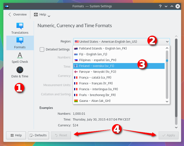
This screenshot, from the System Settings Formats panel, shows some GUI elements. Click on part of the window to learn more about it.
An Icon List (the second item is selected)
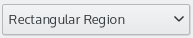
An open Drop Down Box
An item in the Drop Down Box that has been selected
Some more Buttons
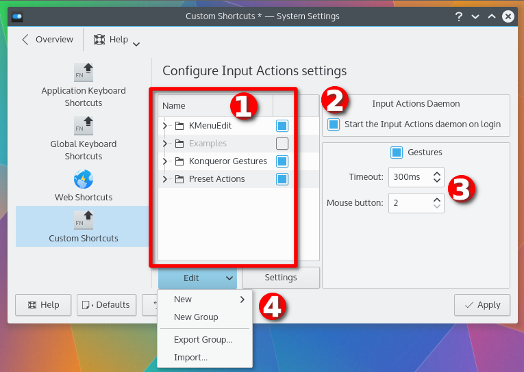
This screenshot, from the System Settings Custom Shortcuts panel, shows some more GUI elements.
A Check Box that has been selected
A pair of Spin Boxes
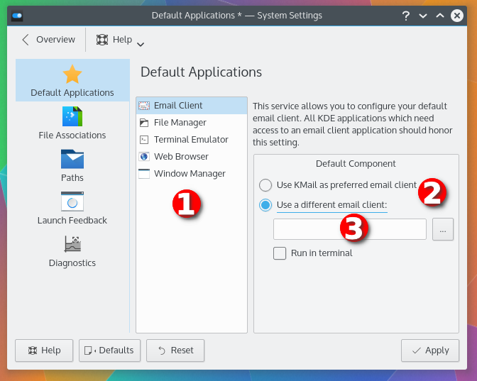
This screenshot, from the System Settings Default Applications panel, shows even more GUI elements. Click on part of the window to learn more about it.
A List Box
A pair of Radio Buttons
A Text Box
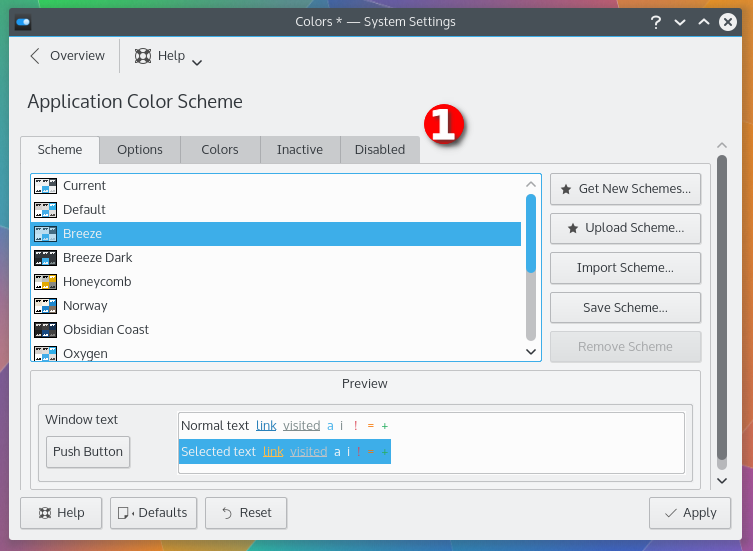
Finally, this screenshot, from the System Settings Colors panel, shows five Tabs
| Name | Description | Screenshot |
|---|---|---|
| Central Widget | The main area of the running application. This might be the document you are editing in a word processor or the board of a game like Chess. |
|
| Button | These can be clicked with the mouse button to perform an action. |

|
| Breadcrumb | Shows the path in a hierarchical system, such as a filesystem. Click on any part of the path to go up in the tree to that location. Click on the arrow to the right of part of the path to go to another child element of that path. |

|
| Check Box | These can be clicked to select and unselect items. They are typically used in a list of several selections. Selected items typically display a check mark, whereas unselected items will have an empty box. |

|
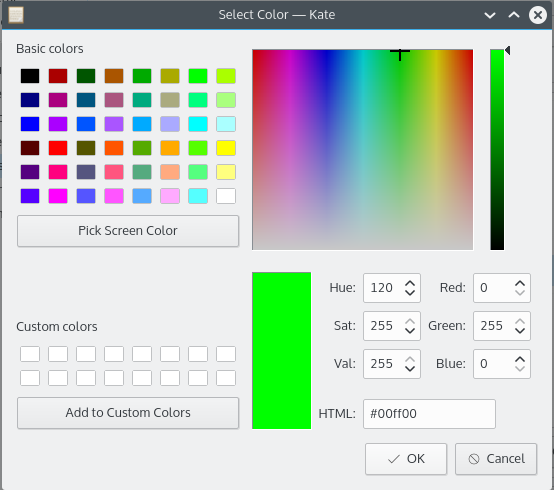
| Color Selector | This allows a color to be selected for various purposes, such as changing the color of text. For more information, see the section called “Choosing Colors” |
|
| Combo Box | A combination of a Drop Down Box and a Text Box. You can select an option from the list, or type in the text box. Some combo boxes may automatically complete entries for you, or open the list with a list of choices that match what you have typed. |
|
| Context Menu | Many user interface elements in the Plasma™ Workspace and in Applications contain a context menu, which can be opened by clicking on something with the mouse button. This menu contains options and actions that usually affect the user interface element that was right-clicked. |
|
| Dialog Box | A small window that appears above a larger application window. It may contain a message, warning, or configuration panel, among others. |

|
| Drop Down Box | This provides a list of items, from which you may select one. |
|
| Icon | A graphical representation of something, such as a file or action. They typically, but not always, also contain a text description, either beneath or to the right of the icon. |
|
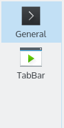
| Icon List | This provides a list of items represented by an Icon and a description. It is typically used in the left panel of configuration panels to allow selection from various types of configuration categories. |
|
| List Box | This is a list of items that typically allows multiple items to be selected. To select a group of contiguous items, press the Shift key and click the first and last items. To select multiple items that are not contiguous, press the Ctrl key and select the desired items. |
|
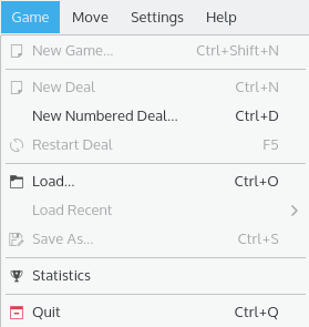
| Menu | A list of selections, that usually perform an action, set an option, or opens a window. These can be opened from menubars or menu buttons. |
|
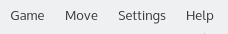
| Menubar | These are located at the top of nearly every window and provide access to all the functions of the running application. For more information, see the section called “Common Menus”. |
|
| Menu Button | A special type of button that opens a menu. |

|
| Panel or Sidebar or Tool View | These are located on the sides or bottom of the central widget and allow you to perform many different tasks in an application. A text editor might provide a list of open documents in one, while a word processor might allow you to select a clip art image. |
|
| Progress Bar | A small bar that indicates that a long-running operation is being performed. The bar may indicate how much of the operation has completed, or it may simply bounce back and forth to indicate that the operation is in progress. |

|
| Radio Button | These are used in a list of options, and only permit one of the options in the list to be selected. |

|
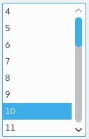
| Scrollbar | Allows you to navigate a document. |

|
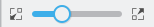
| Slider | Allows a numeric value to be selected by moving a small bar either horizontally or vertically across a line. |
|
| Spin Box | This permits a numerical value to be selected, either by using the up and down arrows to the right of the box to raise or lower the value, respectively, or by typing the value into the text box. |

|
| Status Bar | These are located at the bottom of many applications and display information about what the application is currently doing. For instance, a web browser might indicate the progress of loading a web page, while a word processor might display the current word count. |

|
| Tab | These appear at the top of an area of a window, and permit that area of the window to be changed to a variety of different selections. |

|
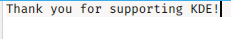
| Text Area | Allows a large amount of text to be typed in, typically multiple lines or paragraphs. Unlike a Text Box, pressing Enter will usually result in a line break. |
|
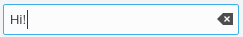
| Text Box | A single-line text entry that allows a small amount of text to be typed in. Typically, pressing Enter will perform the same action as clicking the button. |
|
| Titlebar | This is located at the top of every window. It contains the name of the application and usually information about what the application is doing, like the title of the web page being viewed in a web browser or the filename of a document open in a word processor. |

|
| Toolbar | These are located near the top of many applications, typically directly underneath the menu bar. They provide access to many common functions of the running application, like Save or Print. |

|
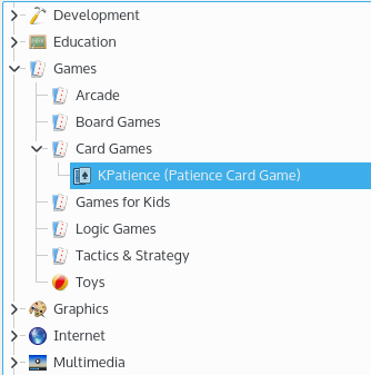
| Tree View | A Tree View allows you to select from a hierarchical list of options. A section, or category, of the Tree View may be unexpanded, in which case no options will appear beneath it and the arrow to the left of the title will be pointing right, toward the title. It may also be expanded, in which case several options will be listed below it, and the arrow to the left of the title will be pointing down, toward the options. To expand a portion of the tree view, click the arrow to the left of the title of the section you wish to expand, double-click on the title, or select the title using your keyboard's arrow keys and press the Enter or + key. To minimize a portion of the tree view, you may also click the arrow, double-click on the title, or press the Enter or - key. |
|