In this chapter you will find explanations on how to build a simple plot from spreadsheet data.
Click on the button or press Ctrl+N on the keyboard.
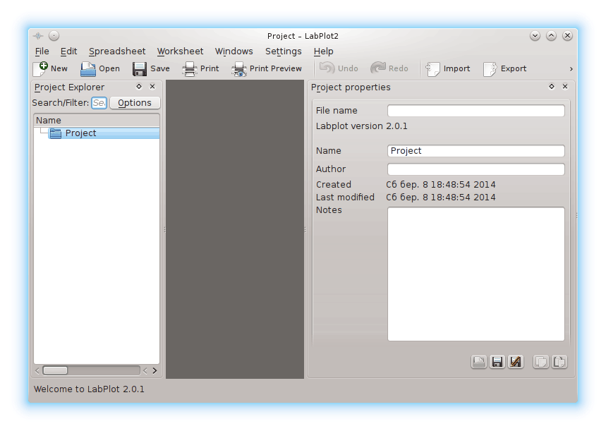
Click on the Project item on the Project Explorer panel with the mouse button and choose → or press Ctrl+= on the keyboard.
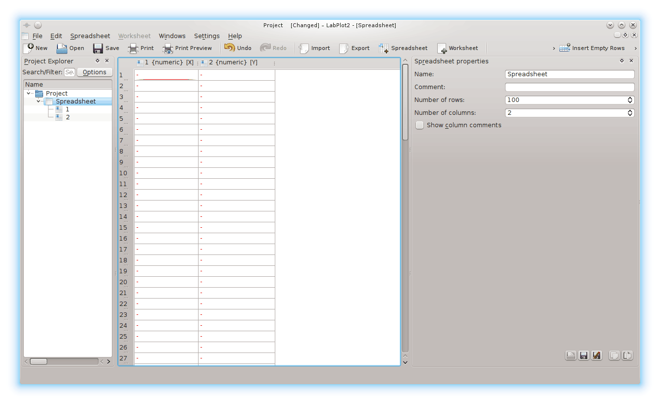
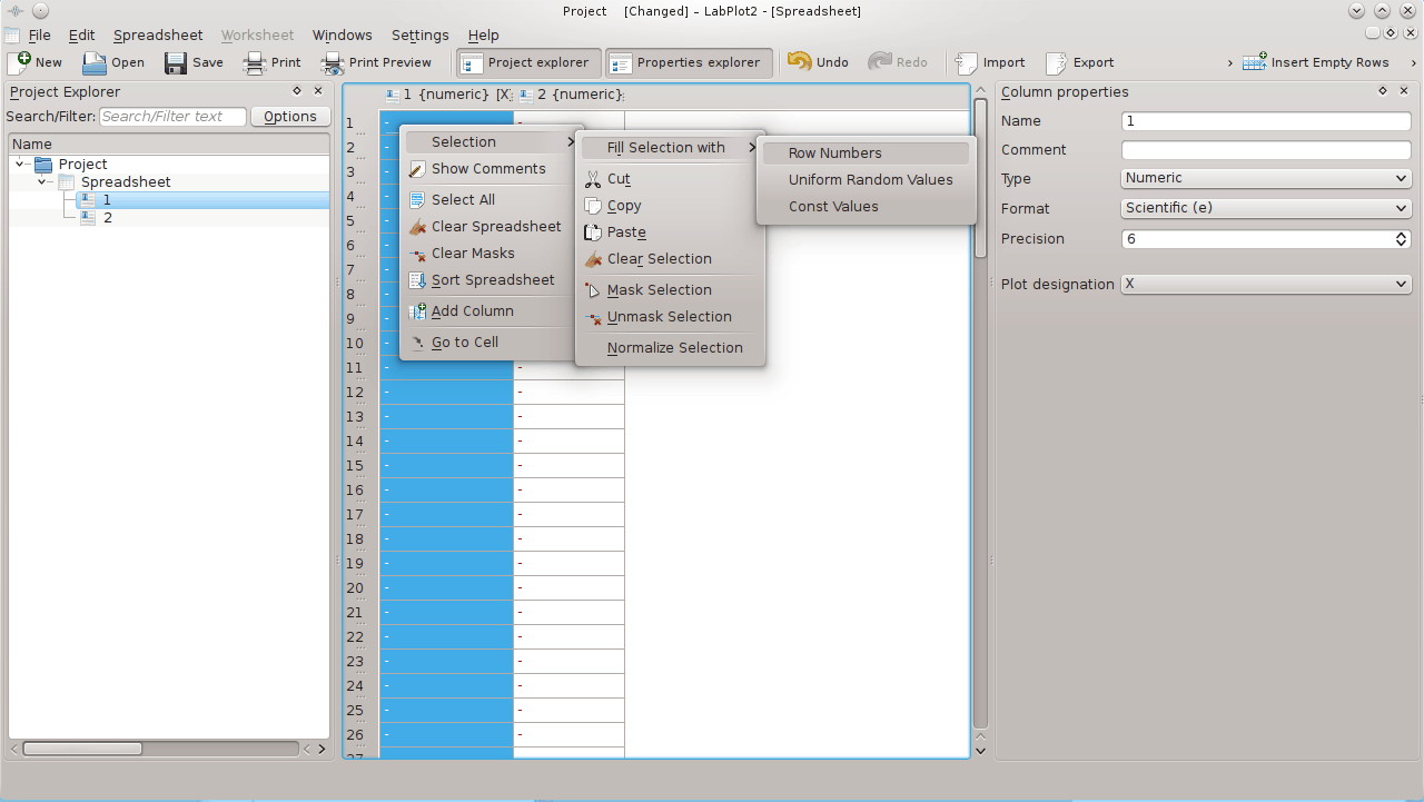
Click on the header of the first column of the spreadsheet with the mouse button then click on any of its cells with mouse button and choose → → .
Select from the Format drop down box on the Column properties right dock to enhance data presentation for the first column.
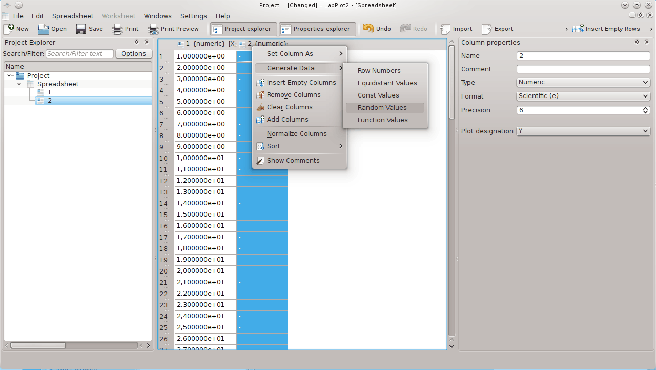
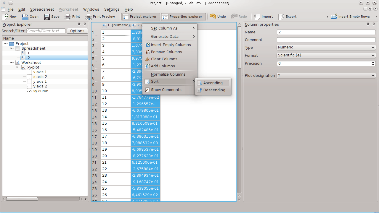
Click on the header of the second column of the spreadsheet with the mouse button and choose → .
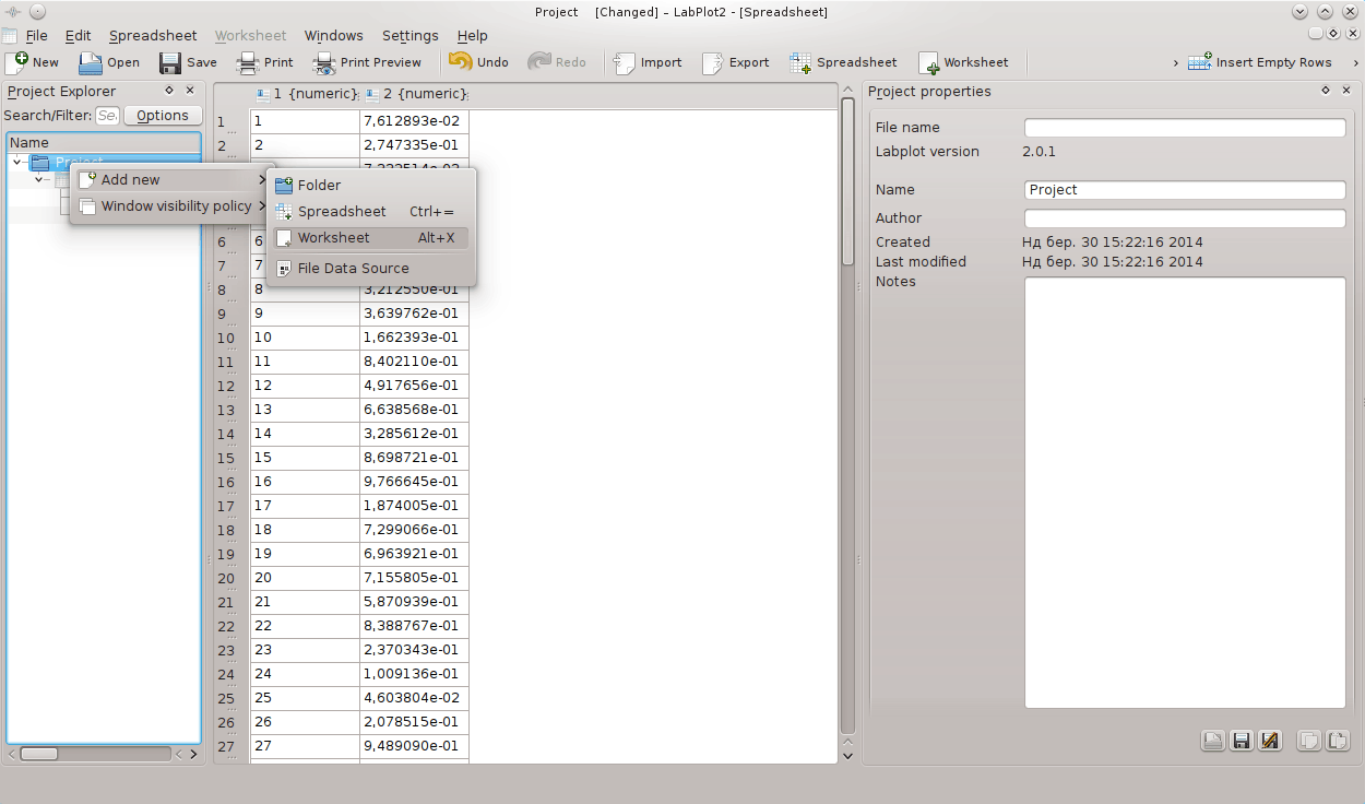
Click on the Project item on the Project Explorer panel with the mouse button and choose → or press Alt+X on the keyboard.
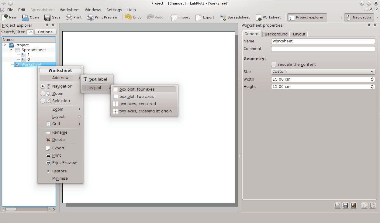
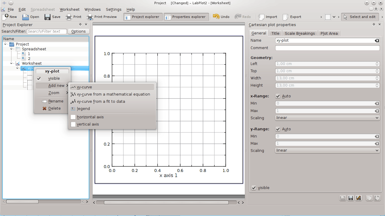
Click on the Worksheet item on the Project Explorer panel with the mouse button and choose → → .
Click on the xy-plot item on the Project Explorer panel with the mouse button and choose → .
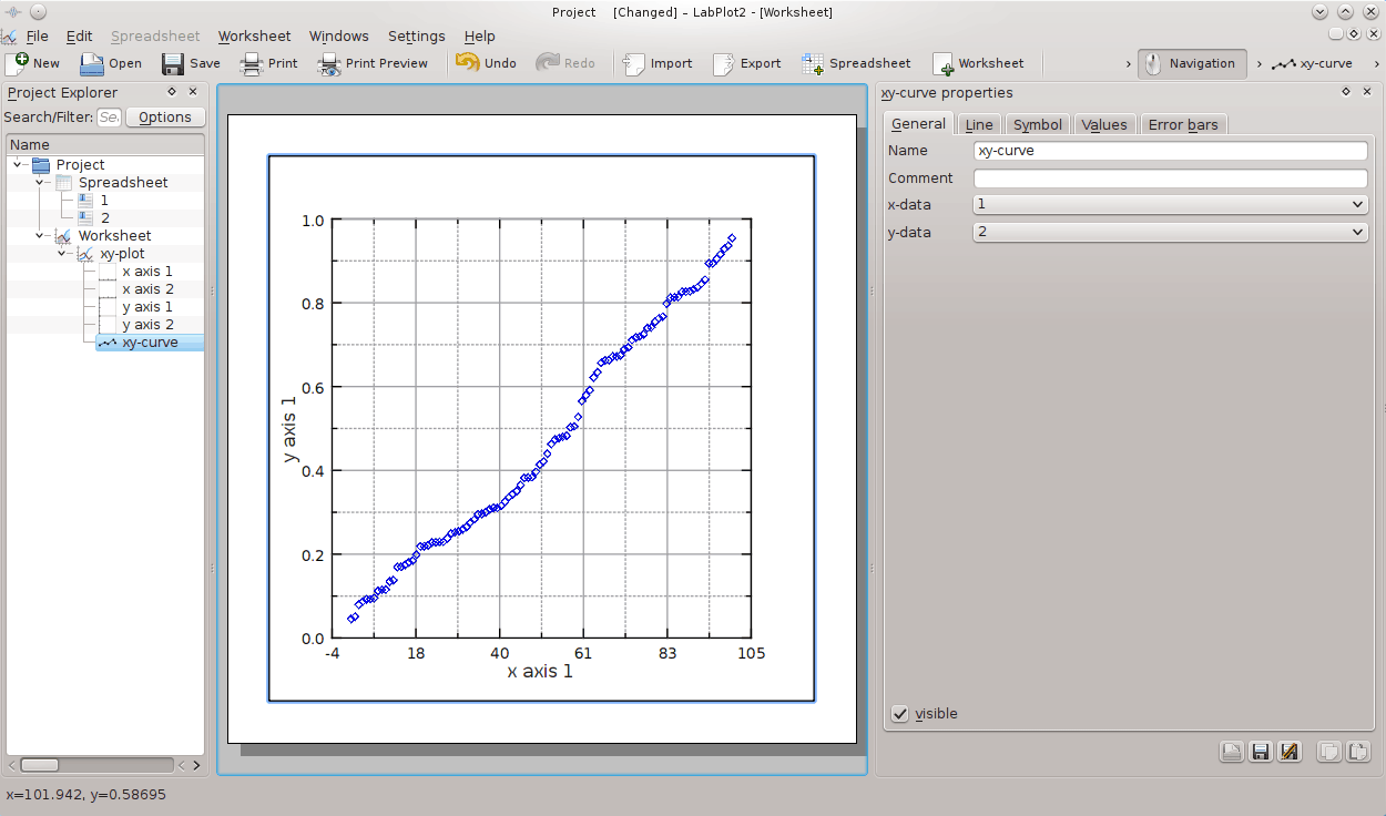
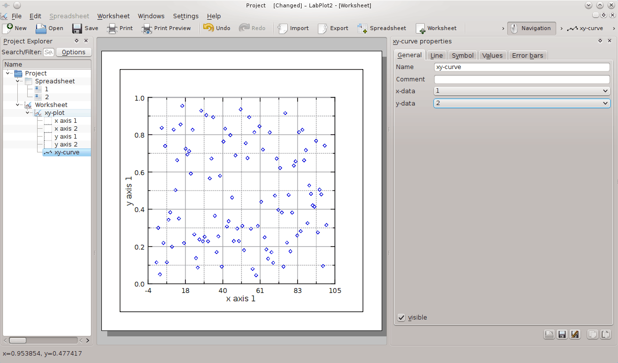
Use the xy-curve properties pane on the right to select → → in the x-data field (just click on the item and press Enter). Use the same procedure to select for the y-data field. The results will be shown on the worksheet immediately.
Click on the Spreadsheet item on the Project Explorer panel with the mouse button then click on the second column header with the mouse button and choose → .
Click on the Worksheet item on the Project Explorer panel with the mouse button to see the results.