 The Form Design Tab
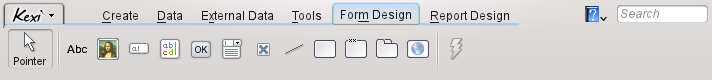
From the Form Design tab you can you select widgets to add to your form.
- Pointer
Pointer, switches to the widget selection mode.
Note
Selecting any widget, will switch to the widget add mode. Then you can click anywhere on the form to place the widget.
- Label
A Label widget displays predefined information on a form. Usually it is used as a caption next to other data-aware widgets.
- Text Box
A Text Box is a single line container for data contained in your table.
- Text Editor
A Text Editor is a multiline container for data contained in your table.
- Combo Box
A Combo Box displays a list of options to choose from.
- Check Box
A Check Box holds two or three states of data (e.g. On/Off)
- Image Box
An Image Box holds an image, bound to a field in a table.
- Button
A Button allows you to define actions to be executed upon clicking on it.
- Frame
A Frame is used as a container for other widgets.
- Group Box
A Group Box is used to group other widgets and control their state.
- Tab Widget
A Tab Widget is used as a container for other widgets and can have many pages that contain different widgets.
- Line
A Line is used as a logical separator between different parts of a form.
- Web Browser
A Web Browser is a widget that allows to display a web page inside the form.
- Assign Action
Assign Action is used to assign an action to be executed when an event occurs (e.g. clicking on a button).