Skrooge allows you to build highly customized reports, for a deep analysis of your financial status.
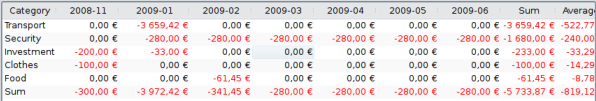
A report is composed of a table (on the left) containing all data used to draw the graph (on the right). The table can be filtered using the dedicated field above, causing the graph to be redrawn with filtered data.
You can choose to display only the table, only the graph, or both.
- Table
Display the table.
- Graph
Display the graph.
- Text
Display the text report, hide table and graph.
This is where you choose the data to be present in the report. Select what will be shown in lines and in columns, and the mode of computation. There are two distinct values for the mode:
- Sum of transactions
In this mode, the total amount of transactions for each month will be computed. If you selected "category" in line, and "month" in column, this will compute the total amount of transactions for each category and for every month.
- Cumulated sum of transactions
If we reuse our previous example ("category" in line, "month" in column), we will have here a cumulated sum, i.e. for each month, we will compute the total amount of transactions up to this month, for each category.
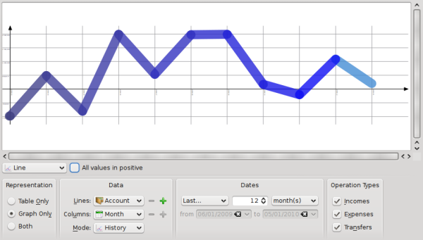
As a practical example, this author uses this mode to draw the evolution of his accounts balance by setting "Accounts" for Lines, and "Month" for Columns.
- Base 100
Like "Sum of transactions" but on base 100.
- Cumulated sum in base 100
Like "Cumulated sum of transactions" but on base 100.
- Percent of columns
The values are expressed in percent of the high column value.
- Absolute percent of columns
The values are expressed in percent of the high column value in absolute.
- Percent of lines
The values are expressed in percent of the high line value.
- Absolute percent of lines
The values are expressed in percent of the high line value in absolute.
- Count number of transactions
.
For lines and columns, it is possible to expand the level of data presented using the icon  right of the field. Use this to show subcategories in the report.
Use this to specify the date range for your report. You can use several ways to specify the date range that should cover pretty much every possible date range you need.
Select the type of transactions you want to include in your report. For example, if you want to draw a graph showing your expenses distribution per category, you probably do not want to include "Incomes" to your report.
From this section, you can select some other filters defined by selection done in other pages. If you want a report only for the categories "Food" and "Gift", you just have to open the page of categories, select the two categories and come back to the report to activate the corresponding filter.
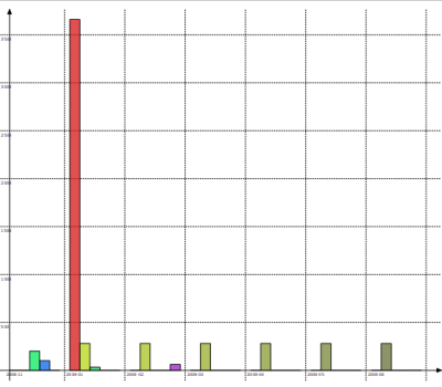
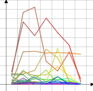
Once everything is set up to your needs, you should select the graph appearance using the drop down box below the graph. To better understand the differences between each type, let us build a report showing expenses per category (lines) and month (columns):
One bar per line, columns stacked.
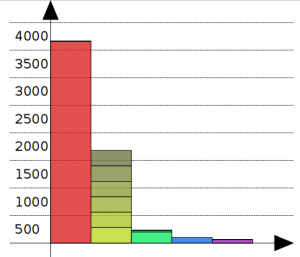
The second bar (yellowish) shows category "Security", all months stacked up.
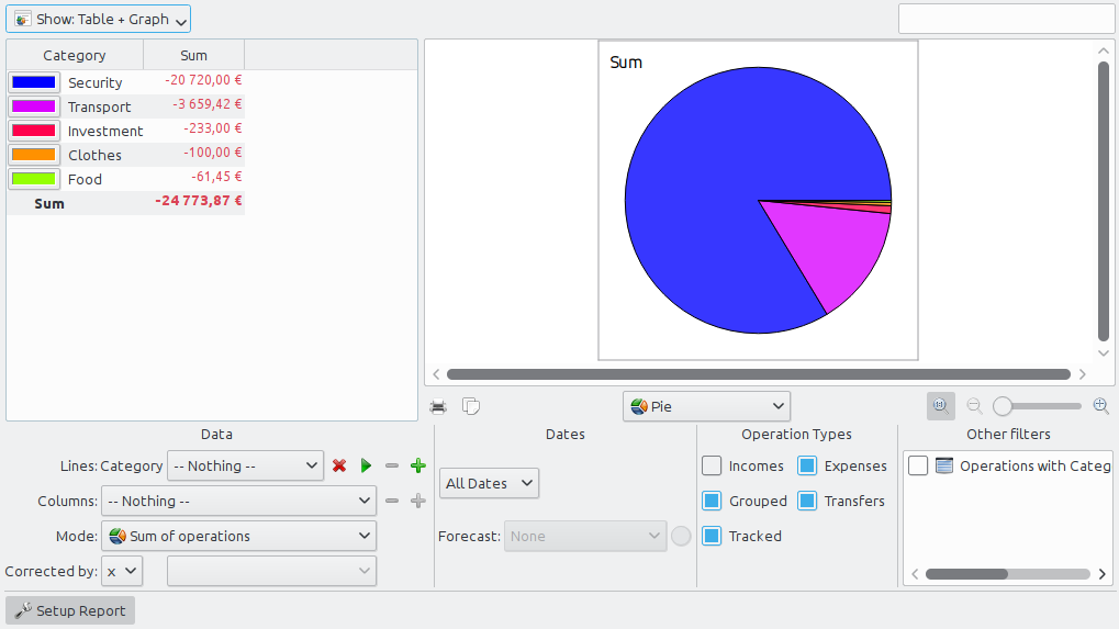
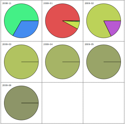
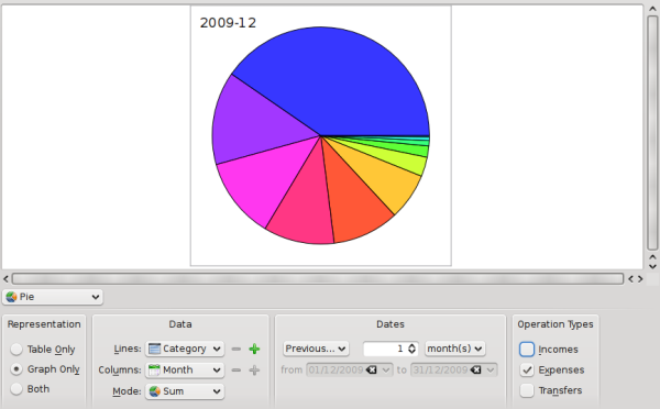
The classical pie graph. If the selected value for column is different from "nothing", displays one pie per column.
Skrooge makes it possible to zoom in a graph for getting all the small details. Use the zoom control zone above the graph:

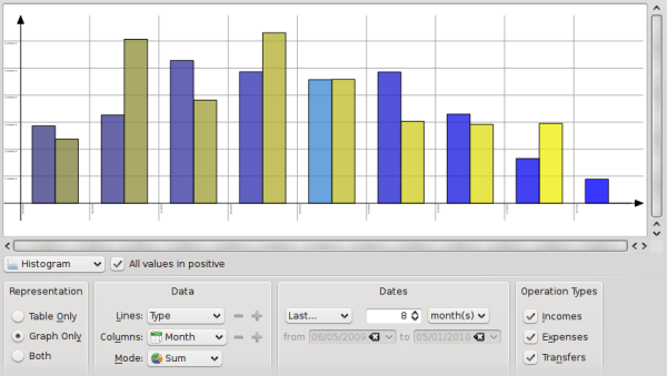
Here are some screenshots showing some classical report configurations. You may use them as a reference for your own reports.
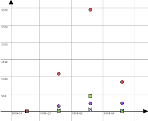
For each month, compare the total amount of incomes versus the total amount of expenses. Incomes are in blue, expenses in yellow.
By double clicking on an item of a graph, you will open the transactions included in this item.
You can open a new report based on an item of a graph too.
So you know you can make a deep analysis of your finances thanks to reports. But how deep is deep? Well, that's even deeper than you imagined… If you are interested, read the hands on exercise analysing this author's expenses during its holidays :)